
Design
System
About Brand
DAL Food is the largest and most diverse food company in Sudan focused on providing affordable, basic, staple foods and drinks for mass consumption. Their users can buy products on the Web and mobile (Android and iOS).
Problem statement
Over the years, Dal's product growth lacked structured design planning. Now, with the new mobile app launch, they're addressing this issue by developing a new visual identity to tackle the user experience inconsistencies across platforms.
Responsibilities
I was part of a cross-functional team that had weekly meetings to sync about this initiative. And my duties varied from research, definition, UI design, Documentations and much more.
Why we need a new design system
When I joined the project, I was tasked with developing a new visual identity for the app based on the branding. The key to doing this successfully was developing a systematic way of refactoring styles and components based on the brand guidelines that had already been in use.
To better understand the task, I started auditing our brand’s different platforms; i.e website, brand docket and marketing material (both digital and print). After this we listed out all instances of particular components used over various platforms (i.e buttons, drop-down, input fields & etc) on the different pages and flows.
Here are the 4 guiding principles for my approach
-
Design System
A well documented and adopted design system was the first step. It would provide the foundation we needed to usher in a new design language
-

Design tokens
Our design decisions for accessibility, dark mode and interaction where easily communicated with the use of design tokens.
-
Accessibility
Consider users with disabilities, covering colour contrast, keyboard navigation, and screen reader compatibility.
-

60-30-10 rule
This principle gave us a measured approach that ensured colour and negative space were used in a purposeful and measurable way.
The Design System
We decided to focus first on the foundational elements (atoms) of our design system, such as colour palettes, fonts, grid, spacing, buttons, etc., and then move on to more complex blocks and pieces (molecules, organisms, templates, pages). We created components from scratch since we are creating a new visual identity as it served our design needs better.
Some of the activities at this stage involved:
Researching other design systems and interfaces for components common practices and inspiration.
Analyzing the instances and use cases captured during the audit and ideating on the solutions that serve our goals best.
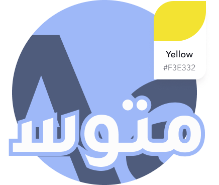
Unifying: we merged different variations of components to leave only the essentials. For example, we limited our color schemes to a maximum of 7 shades for each hue and all the excessive variations were matched and merged with the decided upon schemes based on proximity. Below is our final color palette:
Colors
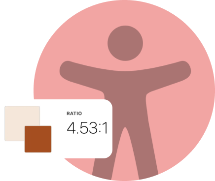
Our design system leverages a purposeful set of color styles as the perfect starting point for any brand or project. When it comes to color, contrast is critical for ensuring text is legible.
We've tested CAG 2.1 contrast ratios to our color system so you can make sure you're designing with accessibility in mind.
Typography
Our design system accommodates multilingual content, , it is crucial to ensure our design system supports diverse languages while maintaining consistent and accessible visual communication
Icons
Our design system typically includes a library of carefully curated and designed icons. These icons are created to align with the overall visual language and ensuring that they are consistent on various platforms.
Strokes and shadows

Design tokens
Design tokens are all the values needed to construct and maintain a design system — spacing, color, typography, object styles etc.
These can represent anything defined by design and for us, that meant starting with color palettes and font sizes.
Our tool of choice for converting our tokens was Style Dictionary. An industry standard in top design teams around the world.

Building Design components
For the creation part, we made sure that each of our components is:
For that, we needed to evaluate the combination of text and background color based on the WCAG recommended ratios. High color contrast helps users who are partially or completely color-blind see differences between certain colors. It creates a strong visual hierarchy and improves usability for everyone. More than that, we are using all caps style for characters on CTAs as well as a comfortable character spacing to enhance accessibility.

Accessibility
Multi - Lingual
Our design system, has two languages as this brand‘s target customers was segregated between english and arabic. This workflow allows for easy UI changes.and also automatically reduces the risk of accidental copy changes.

Dual Theme


Our design system is undergoing an evolution to incorporate dual themes - a Dark Theme and a Light Theme. This strategic update aims to enhance user engagement, cater to diverse user preferences, and provide a consistent experience across various environments.
Components & Documentation
Documentation helped organize and deliver our thoughts to stakeholders and development teams. This helped them understand our thought process with a single source of truth.
As design tokens where new to the project, our documentation helped convey how they would be implemented in code.

Impact of
Design system
Working on our design system has been very challenging, but it has brought about many positive benefits for the company on different levels.
Development
This simplified the life of developers. Speaking one language with the design team when discussing implementations. Focus on the feature not the low-level UI primitives (color & space values, small components, interactions, states, etc).
Design
Having a ready-to-use library of components made creating high-fidelity interfaces a straightforward task by bringing designing interfaces from days to a couple of hours.
For the user
The points mentioned above are all related to internal aspects of the company, whereas the sought impact can be seen in the improvement of our user experience.


Reflections
The process of solving this issue has been a major learning ground for me. i am not a expert in building design systems. However, we experienced many challenges that allowed us to improve our soft and hard skills. Here are a few of the challenges:
Limitation of time and resources
Getting everybody on the same page and working together as a unit. Coordinating between designers, developers, and other stakeholders